


#1

#2

I’m very excited to share my goal with you of re-publishing Soul Proprietor myself this spring. Kim Barron of New Leaf Design is creating the design layout and cover. Which brings me to this blog entry.
Knowing the old saw about not judging a book by its cover, I’d like your opinion. I do believe we most certainly judge books by their covers and want your input.
It’s time to vote again!
I’ve narrowed down the selection to two images. The fonts and quotes you see are interchangeable. The feedback I’m looking for is solely (or soul-ly) about the photo. What are your thoughts and why?
I will put all responders names into a hat (regardless of which image you selected) and draw a name to receive a free copy when they’re fresh off the press, so do let me know your thoughts. I’ll announce the winner at the end of February and will consider all responses from now until 2/22/10.
Thank you for reading this and sharing your valued opinions.


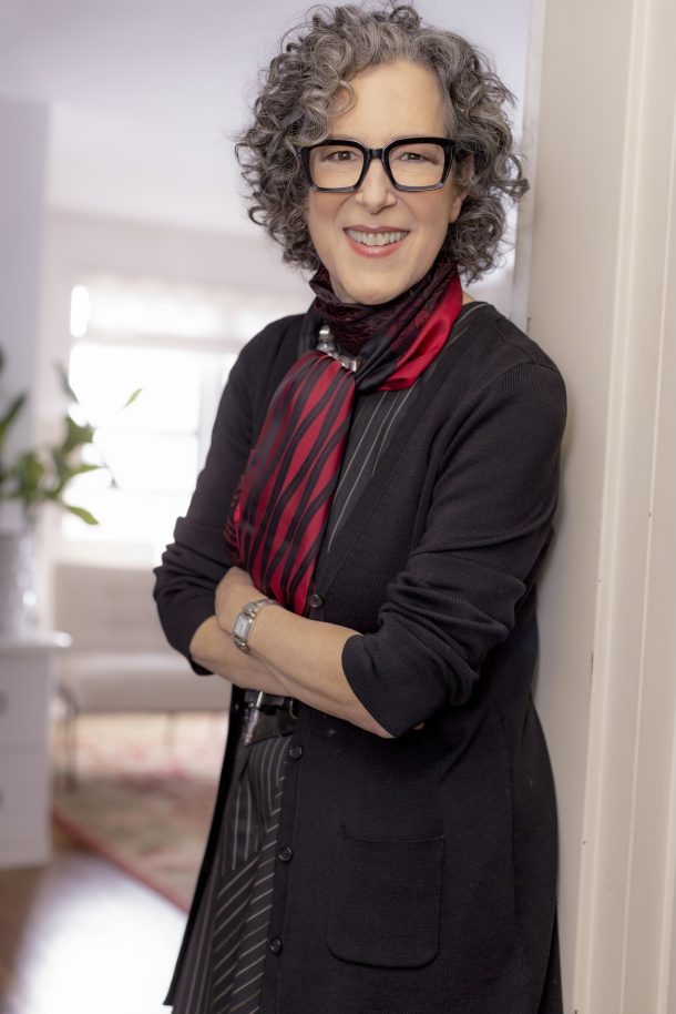
I much prefer the straight-on view–I love being looked at directly!
The first one…of course!!!!! You are looking directly at us and you look great. How’s that?!
#2
You look more approachable!
Oh, Jane, I like both! There are so YOU! Great makeup, jacket, glasses and the pearls…so in line with the new image!
If I had to choose though, I would go for #2 – it’s wisdom and dreaminess in one…
LOVE it!
Hi Jane,
Am thrilled to know you are re-publishing your book. I enjoyed it when I first read it and am looking forward to another read!
I prefer photo#1 – nice eye contact/connection, it is straightforward, you have a wonderful smile, a welcoming expression and you look beautiful. It reminds me of how you look at me whenever we meet! I’m so glad you’ve decided to put yourself on the cover—YOU are your brand identity now!
Can’t wait to see the final!
xo
Laurie
This is a tough one. My graphic designer side says go with the eye-contact photo on the left–but rework the quote text at the top. Never, ever have type across a face. It detracts impact from both. The same applies to the title and subtitle bleeding across your pearls. It distracts.
The flip is the photo itself on the right is more personal–even though it lacks the eye contact connectiveness. I like placement of text more–but am still concerned about immediate readability.
At any rate–both are fine, each is a great photo–and besides, we know it’s the content not the cover!
Definitely the first photo. Warm, engaging, natural and direct eye contact.
I love them both, but prefer the one where you are looking into the light with your chin in your hands. It conveys a thoughtful optimism… a little wit and wisdom, which I know to be true about you! Congratulations and good luck!
The first one…of course!!!!!!!! You are looking directly at us and you look great. How’s that?!
I like the cover with you looking straight forward. The one on the left as shown above. However, it seems there are too many pearls. They are lovely but the long on is distracting from you. Otherwise a great shot.
All the best,
Judy Hallberg
Dear Jane,
I like both pictures very much. I think I’d go with the first one because you are looking straight on toward the person viewing the cover, rather than off to the side. The second picture is a bit more relaxed and makes me think of an “About the Author” photo such as is often found on the back of a novel or the back inside flap of the protective jacket.
PS: I own the CD version of your book and love it!
It’s not difficult for me to make a choice. The top cover shows happiness, satisfaction and success in your smile and pose. You are still full of energy. The bottom photo looks a little tired to me, after all, you are resting your chin on your hand. Your look appears to be slightly surprised at your success, perhaps questioning that you really did it. It also seems like you are looking at someone else in the room, not the reader/photographer, as if you are distracted from your purpose or simply thinking ‘gee whiz’. Also, I don’t like seeing the word Soul on a background of wrinkles in the shoulder of your dress.
It will be interesting to read the other votes/comments!
Jane. I like the cover with you looking at the person holding the book. It feels like you are giving me attention, your wisdom.
Lovely picture of you too.
Blessings on this new venture.
Anne Massey
Okay, I think I’m waffling here. I really do love both photos, especially #2. But now I’m thinking perhaps I prefer #1 as the cover.
Both photos are beautiful, and I love #2 as the final cover. #1 looks like so many other book covers I’ve seen with the head-on photo.
Congratulations!
Both are great, congratulations on re-publishing your book!
I prefer #2.
They are both great but I like the first one where you are looking straight at the camera/us.
love, Leigh
Both lovely shots of you, I like the one of you looking straight ahead the best. It illustrates your incredible talent to connect with people, your amazing intuition and makes me feel like we are already chatting in conversation…
Best wishes for a hugely successful launch! You know I would be honored to help spread the word…
Your smile looks great in both but I like the 2nd photo better. It reflects a more light hearted impression for the book and one I would gravitate to read.
Defintely the photo on the left (#1)
Dear Jane,
Both photographs of you are beautiful. You look wonderful, content and someone whose straight forward advice I’d definitely take. I prefer Photo #1, you looking directly at the viewer (but don’t like the text in your hair). In Photo #2 your arm distracts from your face (but better placement of text). Both photos do a great job of capturing who you are and introducing you as the soul provider.
Love, Mary Quinlan
Image number two. I think you seem more engaged in this image. You’re looking at someone or something off camera that delights you.
@Everyone
Thank you so much for your feedback. So far #1 is pulling ahead. I’ll keep you posted. I appreciate your thoughts and support.
Love,
Jane
both capture you lovliness, but i think #2 captures your wisdom as well!!
Both are fabulous! I like the first photo but I like the layout of the second one with you one the side and text on the other.
Wonderful photographs and covers! I would choose #1 because you are making direct contact with the viewer. You look honest and open, calm and reassuring. #2 is more whimsical – almost playful and cute. You don’t know the answer right now, but you are thinking about it. I wish there was a better place to put the copy in #1 though.
Number two because it looks like you have a secret (but, of course, are willing to share!).
Hi Jane,
#2 it showes me the soft you and your soul wisdom….Beautiful….
Hi Jane,
#2 it showes me the soft you and the soul wisdom….Beautiful….
I like the second version for so many reasons. First, there’s the reaons mentioned by Mary Lynn, Barbara Arelt, and Diane Rosen.
Second, they used to photograph movie stars looking into the distance, instead of at the camera, because it makes the subjects look like they’re fully engaged in an interesting life, and that makes us want to emulate them. When people buy your book, they’re looking for someone to emulate.
Third, bookshelf buyers might want to study you without return scrutiny. Even though your direct look is friendly, people who are perusing the shelves are looking to improve and they might feel that you can see out of that book jacket and into their messy offices.
Finally, I like the layout better. The words aren’t in your hair and you’re looking toward the opening of the book, which seems to say “there’s great stuff in here if you turn the cover back.” I would be quicker to buy the second book than the first.
But what do I know. LoL I’m well in the minority here. I wish you could publish half one way and half the other to see which sells better.
I say #2 — you look more relaxed. I feel like you’re sitting across the table from me…
i like the second photo where you are looking off to the side not straight on – it seems more natural – i especially like the sparkle in your eyes and warm smile – I also like the off-center positioning – not perfectly balanced – also like the writing on the left – keep your image free of words (see hair on the first image)
Beautiful photos, Jane. Number 1 is my favorite for your book cover, hands down! You have a mature, sophisticated, approachable look that is very inviting, especially with the direct gaze at the reader who is picking up your book. What a fresh new look for your book – congrats!
Hi Jane,
They are both terrific…but my personal choice is #2. In #1 you look, to me, a bit self conscious…certainly out there but a bit self conscious. In number 2, you are playful and “other directed” which makes you more attractive and approachable to me.
Good luck !!!
Best,
Carol Spong
Both are lovely pictures and capture your great spirit and engagement. I prefer #2 for many of the reasons others have mentioned, including the visual interest of asymmetry and better placement of the text. You look like you’re enjoying and listening to a wonderful conversation just out of camera range. Makes me curious to know what you’re thinking and who/what engages you!
Congratulations on re-publishing! I like both covers, but am somehow drawn more to the second one. It makes me wonder what you are thinking and what lies beyond…… Sounds silly, but true.
I was so happy to hear that you announce an update of ‘Soul’ at ‘Remarkable’ in Darien. It’s such an integral piece for all entrepreneurs; I love each bit of wisdom and can’t wait to read your new nuggets.
I like photo #1–pulled back yet welcoming and approachable; love the natural looking light; your smile is sincere. Yes, it’s head on–but again, you’re far back enough that it encourages the reader to open the book and see what’s behind the confident woman in the photograph. Best of luck!
They are both wonderful pictures of you, Jane, but for a book jacket I prefer #1. You have presence, directness, confidence, and of course, a beautiful smile. I also like the way it fills the space.
love,
Cookie
Jane – both are wonderful. The design and type placement of #2 is far better than #1, however, I would opt for you looking straight on, since it is a much more confident, solid capture of who you are. Best of luck!
Hi Jane,
Both are great, I love the way you are smiling and looking directly at the camera in the first shot, I love the tightness of the second shot, I just desperately wish you were looking right at the camera instead of off to the side. The quote on the first shot gets lost in your hair and on the other one at first I didn’t even notice it was there until I really looked for it. That being said I like #1 but your designer really needs to move the quote from your hair! I have loved the book since I first met you and have recommended it to so many friends I’m so glad you are republishing it yourself. Congratulations my friend!
Warmest regards,
Carin Heiden Atkins
Carin Atkins Creative Lifestyle
I really like the first one with you looking straight out. Excellent title.
They are both wonderful pictures of you, Jane, but for a book jacket I prefer #1. You have presence, directness, confidence, and of course, a beautiful smile. I also like the way it fills the space.
love,
Cookie
I love the eye contact one, not crazy about text in your curls. But the straight-on look is warm, approachable, and joyful. Nice!
I’m way in the first camp – the direct view. Why? Because I think it’s more flattering.
Hi Jane — Both photos are terrific but my favorite is the photo on the left.
I like it because you are looking me in the eye and it makes me want to speak to you – and hear what you have to say. Seeing this book on a table, I’d definitately pick up the bookto give it a read. Congratulations! xo Denise
i love the first one. Your joy and success shines through, just as if i am speaking directly with you. congrats on the reprint !!! ~ marian
Jane…Congrats on re-publishing your book…I vote for #!…I like the relaxed look…You look great…Hope all is well..Love…Amy
Jane, first of all, hurray to you on the re-publishing!!! I must say I prefer the 2nd one … warmer, more creative, more feeling of “soul” … without taking away from professionalism … my two cents!!! both really great shots of you though!
Second one – hands down.
Jane,
Both great photos, but I like the first one because you are looking directly at your audience. I agree with some of the other comments that the second one looks more playful and fun (and I’m all about fun), but I think connecting with folks is MOST important and that happens when you are looking directly at people. Congrats on the re-publishing. I just finished the book and it had some great ideas.
Jane – I love Kim’s design for the cover, and the photos are terrific! Instinctively, I was drawn to the layout of #2, but I agree with the comments about direct eye contact being more effective. I also think that the position of the type is better in #2. So is there another photo of you with your chin on your hand looking directly at the camera? Whatever you decide to do, I think that either choice would attract people to pick up the book and see what’s inside.
Hi Jane,
I like #2, although they are both great! The second one looks warm and friendly even though it is not a straight on shot, I love it! You look great!
I have read your book several times already, it’s a keeper!
Congratulations!
Jane- You look lovely on both covers! I prefer option #1 as the eye contact exudes confidence. All the best to you.
Hi Jane,
I think the side profile is more artistic and approachable, but the front view (#1) is certainly a stronger statement. Either would work for me and I would buy either of them.
Alison
Jane, I vote for #2. In the first picture I see a wise, engaged and capable woman…but in the second one I see that and more…you seem more relaxed and even more approachable-your warmth and personality jump off the page and I want to get to know you and listen to what you have to say. I prefer the layout of #2 as well…
I’m immediately drawn to option #2. I like the lighting, color tone and the up-close-and-personal feel.
Jane: while you are stunning in both photos and i am fond of number 2,my critique is neither one as i question the composition of the bookcover and feel this ‘black hole’ in your middle background is disconcerting in relationship to the upper shelves of your book case is seemingly a very hard edge supporting your face….i’m very sensitive to surroundings and wonder how the composition of the cover truly speaks to your soul….?
Jane ~ I vote for the first one! I would also like to humbly add that I was really drawn to your book cover (the original Sole Proprietor) because it had your artwork on it. I am a designer desperately trying to find my way in the business world. There are tons of books out there for business owners but what attracted me to your book was the fact that I instantly new it was a book for creative business owners!
It is funny your book is sitting on my dining room table as we speak!!
Jane, Number 2 is my choice. Great photos and layouts.
I prefer the 2nd one. It’s kind of sassy and fun. I prefer the darker type instead of the white.
# 2 Hand under chin
Jane, You can’t go wrong with either one of them — both are wonderful. #2 gets my vote. Love, Patty
Jane,
I think both covers are lovely and either will be a success. If I had to pick, I would pick #1 because I like the direct eye contact and we (the reader) get the benefit of your full smile and energy. I agree with others that the text over photo #1 can be distracting (maybe take out the long strand of pearls over the “OR” and I’m not sure what to do with the quote on the top).
Congrats on republishing!
Gilda
I love to vote! I like #2 – more soul-like, I think! Somehow, it is more engaging to me, which may be ironic, since you are looking away. Congratulations on republishing your book! That’s very exciting!
I like #1 – you convey confidence yet it’s inviting! Great photos, Jane!
Jane, I like both of your cover’s design. The left one is direct and straight, it showas a business woman who knows and gets what she want.
However I would vote for the #2 because it seems like your soul is shining on your face. It looks like you are thinking all of the good things you have reached and done for others.
Jane,
No doubt we all agree: two great choices! But I definitely prefer the 2nd. In addition to Valerie’s well-thought out comments, I would add these reasons:
If I were in a bookstore, the second would draw me in and entice me to want to know more–and want to know the author. Also, you’re closer and feel more connected to the viewer.
I agree with those who said that #2 has whimsy; it seems to me like the book will be more fun to read. And lastly, you appear “forward thinking,” like you see and know something that you are going to share with the reader. And you DO!
Best to you, my friend. Terry
Hi Jane! I think both photographs are beautiful! However, I prefer the cleaner look of the type in #2 because it is not competing with detail in your hair and dress. Personally though, photograph #1 made me feel like you were looking right at me and telling me “you can do it!” Congratulations!
Hi Jane:
The eyes have it. Picture #1. When you look at your reader directly, you engage her in the conversation before she even opens the book. You are saying “Welcome! I am so glad you are here.”
Hi Jane– Much prefer the straight-on view. No contest in my opinion. –Prill
#1 Packs the punch! That’s a confident woman who knows who she is and has the deliverables!
God bless this best seller.
First, let me say that your marketing strategy for this vote is a success! Look at all the comments you’ve already received! Is the “free book” drawing the secret ingredient that got us all to take the time to vote? Could be… Which just goes to show you that your book is a DESIRED commodity for entrepreneurs like us 😉 and will hopefully translate into many, many sales when the new edition is released! I already have a copy of the earlier edition, but would love to have then new one to pass on to an aspiring Soul Proprietor!
Now for my vote: I work in a bookstore, and see LOTS of books. My first impressions was to go with cover #1 but that might be simply because I liked it when I saw it (my pc only showed the top one when I opened the email, the bottom was hidden). BUT when I started thinking about how the book would look on the shelf of a bookstore…. competing with so many other books for the buyers attention… I reconsidered and am officially choosing BOOK COVER #2.
And yes, I’m always this wordy… drives my hubby nuts 😉
Wishing you great success, Jane!
I prefer #2, it looks a little more unpredictable and fun and glamorous….we all need more glamour, humor and whimsey mixed with smart and grounded-in-reality advice!
Jane – I too love #1 with direct glance. However, the type goes through your necklace. I Know its an old habit but it still holds true. Best to you!
@All
Thank you, thank you, thank you, for your well-considered and thoughtful comments and responses regarding the choice of covers. I’m intrigued by the variety of input ranging from ‘pick neither’, ‘go back to the original’ to ‘Both are great!’ and ‘Definitely #1’ and ‘Definitely #2’. I’m going to hold to my deadline of 2/22 for input and then weigh the responses. What I’m clear about is that you are interested in the book no matter what. And for that I am very grateful.
Jane
Beautiful photos of you!
Although I would generally recommend you look directly at us, I prefer the other photo for it’s friendliness. Maybe, if there’s enough left on the right side of the photo (or add in Photoshop), you can crop the straight-on one like you did the side view version–so you are all the way on the left. That would leave the right area for the text. I would have liked a version of the side view one with you looking at us–kind of a blend of the two.) You might consider making the entire background dark and getting rid of that top, somewhat distracting, part of the photo.
That said:
1) Try breaking the type so so it doesn’t run over the pearls
2) People read left to right, so with that much text at the top of version 2, I would make it flush left, Actually, I would cut the copy!
3) Also appears a bit hard to read when that type overlays that part of the photo at the top, thus my suggestion to make entire background dark and lose that part of the photo.
4) I think you can lose the border, you are attractive enough without it!
Congrats on bringing out the book again.
Robin
Jane, both photos are lovely, but I think women are too often photographed looking dreamy and soft with tilted heads, and I’m not sure it sends the right message here. As you are a strong, self-assured woman who coaches women to be strong and self-assured, I prefer the straightforward, direct eye-contact approach. To me it demonstrates (and models for your audience) confidence and authority, while your smile still shows you to be friendly and approachable.
At the risk of going against the popular trend, I prefer the right hand side. I find your smile there to be more the authentic Jane I so enjoy working with! (Your chin leaning forward better conveys the level of engagement and attentive listening I so appreciate from you.) And I also feel that your smile in #2 has that wisdom and sense of humor better captured than #1. But again, your skills are many, and therefore your talents are difficult to cenvey in a single photo. Congratulations on a tough choice and the book’s ongoing relevance. And thank you for sharing your many talents with us!
@Brooke
Glad to have your voice added to the mix. As always, your thoughts are well-considered and highly valued.
Thanks for the opportunity to participate in your continued successful progress! I prefer the one on the left, the one that makes me feel like I am right there with you (or you with me!). I look forward to the “new edition!”
#2 is more approachable and I would choose that if you want people to pick up the book to determine if they want to buy it. That’s my choice.
Jane, Both images are great, and I don’t think you could go wrong with either. That said, and although I get the direct eye contact thing in image #1, I prefer #2. You look like your deep in thought, with a warm and content look about yourself, which says–I’m successful, I’m content and I’m confident. If you want to look like this, read me! I’d love to give you print quotes when you have the specs ready.
@Barbara
I’m having a ball reading everyone’s thoughts on this. I do agree that I can’t go wrong with these choices. Thanks for the input and offer to quote prices. I’m all set on that front.